< Main PortfolioUI/UX / MaxxKonnect Case Study

MaxxKonnect — Case Study | Joel Maxwell
CASE STUDY · MAXXKONNECT | Website Design & Development

Loud and Clear — A Website Redesign That Finally Told the Story

Role
Contract Designer
Industry
Radio Station Suppliers & Service
Audience
Owners, Operators & Maintenance
Website
MaxxKonnect.com
01 · The Setup

I Went There for Something Else Entirely

I went to MaxxKonnect's office that day to talk about trade show materials. I was early, so they invited me to sit in while they wrapped up an internal meeting. For the next hour I listened to them talk about their business — connectivity plans, broadcast hardware, engineering services, software platforms. And the whole time, one thought kept nagging at me: Wait... you guys do that too? I had no idea.

That wasn't a knock on the company. MaxxKonnect knew exactly what they did and did it well. Their tagline even said it plainly: "They understand broadcast operations, focusing on solving practical problems stations face daily. That is what we do!" The problem wasn't the business. It was the website. Everything they offered was technically there — buried in copy, scattered across pages, invisible to anyone who wasn't already a customer. A station owner landing on that site for the first time had maybe five seconds to understand the value. The site wasn't giving it to them.
"If the designer in the room can't figure out what you do, your customers can't either."

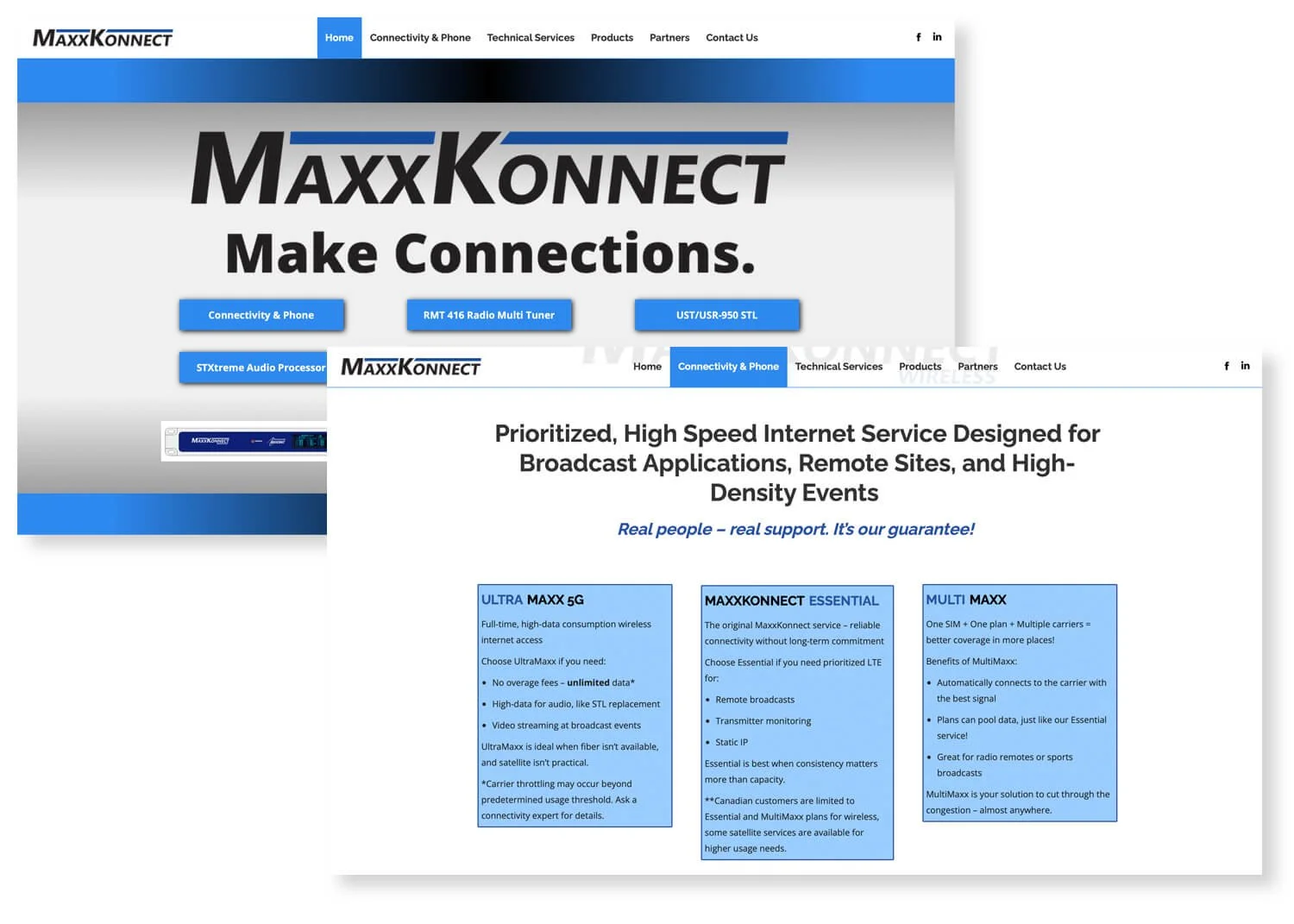
// ORIGINAL SITE DESIGN
The original site was full of great information, it just needed help telling its story
02 · The Pitch

That Night I Went Home and Mocked Up a Prototype. Nobody Asked Me To.

I just couldn't let it go.

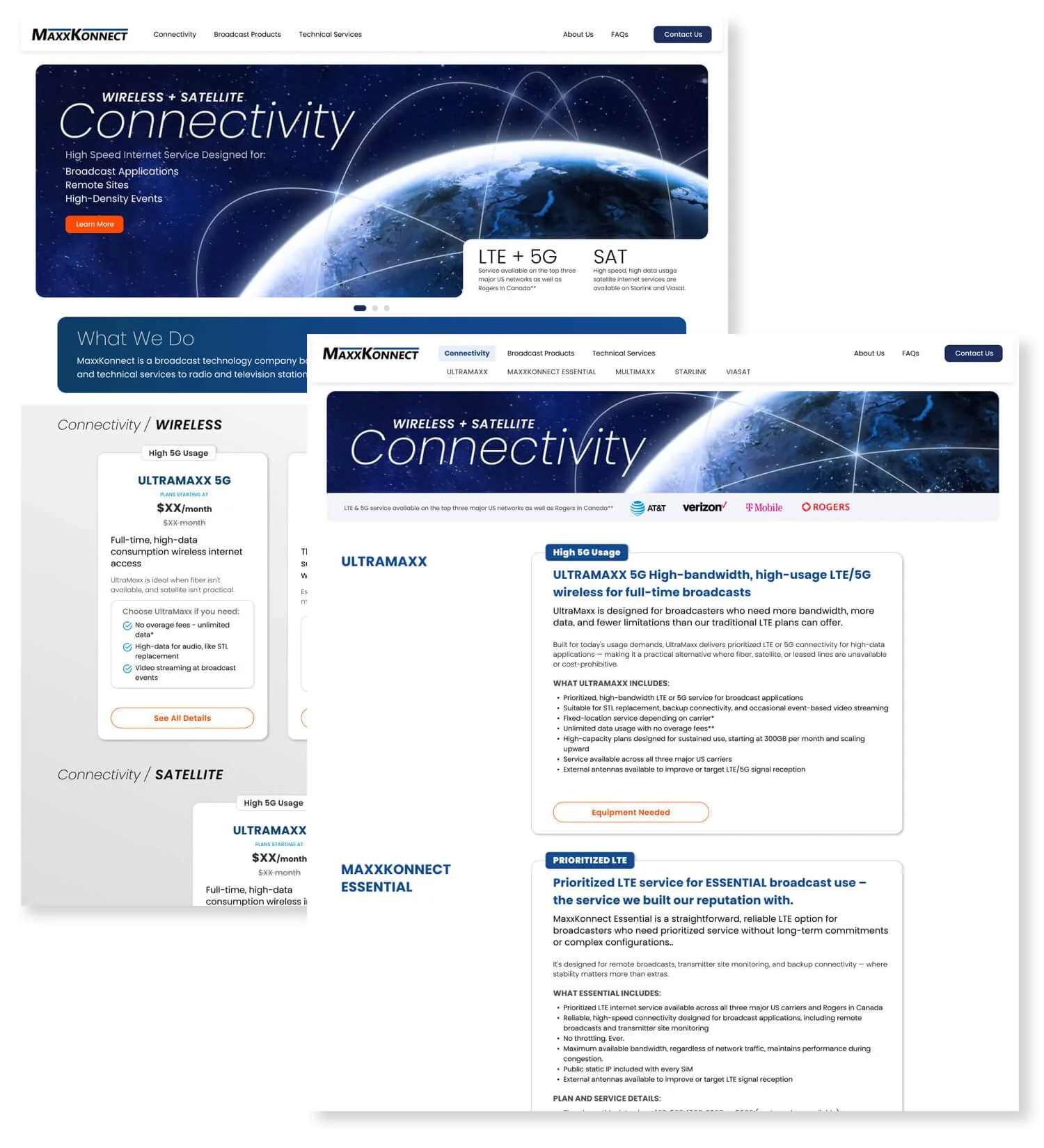
The prototype focused on one thing: making their story scannable in seconds. MaxxKonnect isn't just a hardware supplier. They're a connectivity provider — think signing up for a phone plan, but for broadcast infrastructure. That framing changes everything about how the site should work. I mocked up two pages: a high-level preview with quick plan information and pricing, and a deep-dive page with full specifications for each connectivity tier.

The goal was to serve two audiences at once — station owners who need to make a fast decision, and operators and engineers who need every technical detail before they commit.

I brought it back to them. They said yes.

// FIGMA PROTOTYPE
Connectivity pages redesigned to look more like ecommerce options
03 · The Build

From Microphone to Antenna

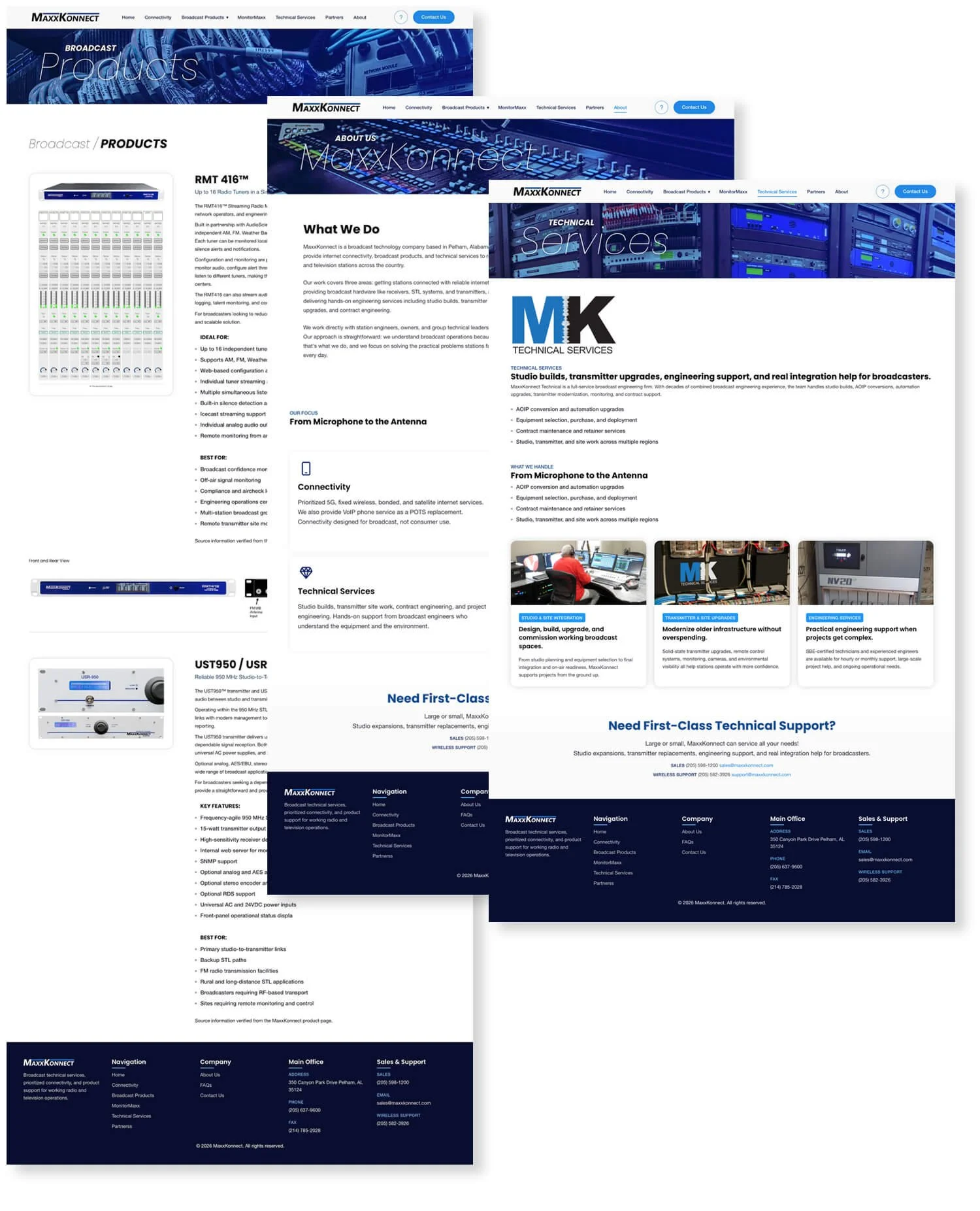
I don't write code from scratch — and I'll own that as a deliberate choice, not a limitation. I start with a solid code stack: page structure in place, base styles set, JavaScript ready. Then I build up one page at a time, making it my own. It's like buying a house with good bones and redesigning every room. For MaxxKonnect, that meant a scrolling hero index page selling their three core offerings at a glance — connectivity, products, and services — each with enough information to pull the right visitor deeper into the site.

For the most part I figure the code out myself. I've done it enough that it comes back quickly. But when I hit a layout problem I can't crack in a reasonable amount of time, I bring in Claude. Not as a crutch — as a collaborator. Claude handles the things I don't want to spend time on: naming conventions, find-and-replace tasks, auditing page tags, style sheets, and JavaScript. The puzzle is still mine to solve. Claude just helps me move faster on the parts that don't require my judgment.

Samples of Built Pages
03 · The Sell

A Hero to the Rescue

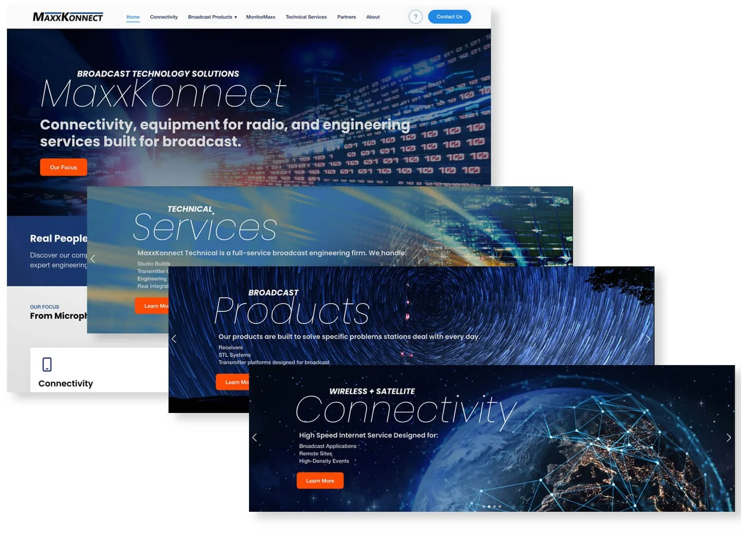
A great website doesn't make visitors work to understand you. It tells them immediately — with imagery, hierarchy, and just enough copy to pull them in. The hero carousel on the new MaxxKonnect site does exactly that. Three slides, three offerings, three seconds to know what this company does. Connectivity. Products. Services. Each slide leads with the category, names the offering, and gives the visitor just enough detail to know if they need to go deeper.

That's the entire thesis of the redesign in motion. No digging. No guessing. No leaving the page wondering what MaxxKonnect actually does.

// SCROLLING CAROUSEL
Various Hero Images
04 · In Closing

By Design — Loud and Clear

The best thing about this project is how it started. I walked into MaxxKonnect's office to talk about trade show materials and walked out with an entirely different project — one that mattered more. That's what happens when you actually listen. A website that can't tell your story in five seconds isn't a website. It's a missed opportunity. MaxxKonnect had the story. They just needed someone to hear it first — and then help the rest of the world hear it too.

"This is Joel Maxwell, signing off until next time."