< Main Portfolio / McLeod Software Case Study

McLeod Software — Case Study | Joel Maxwell
Case Study · McLeod Software

Modernizing a Legacy TMS — One Screen, One Workflow at a Time

Role
Director of User Experience
Duration
6 Years (2019–2025)
Industry
Transportation Management Software
Products
PowerBroker · LoadMaster
Overview of the Challenge

The unspoken design philosophy was simple: if it works, it's fine.

McLeod Software had spent decades building powerful enterprise tools without a single dedicated designer on staff. UI decisions lived with developers and product owners — people who knew the product deeply but were never meant to carry design alone. I was hired to change that, bringing structure, intentionality, and user-centered thinking to workflows that had grown organically for years.

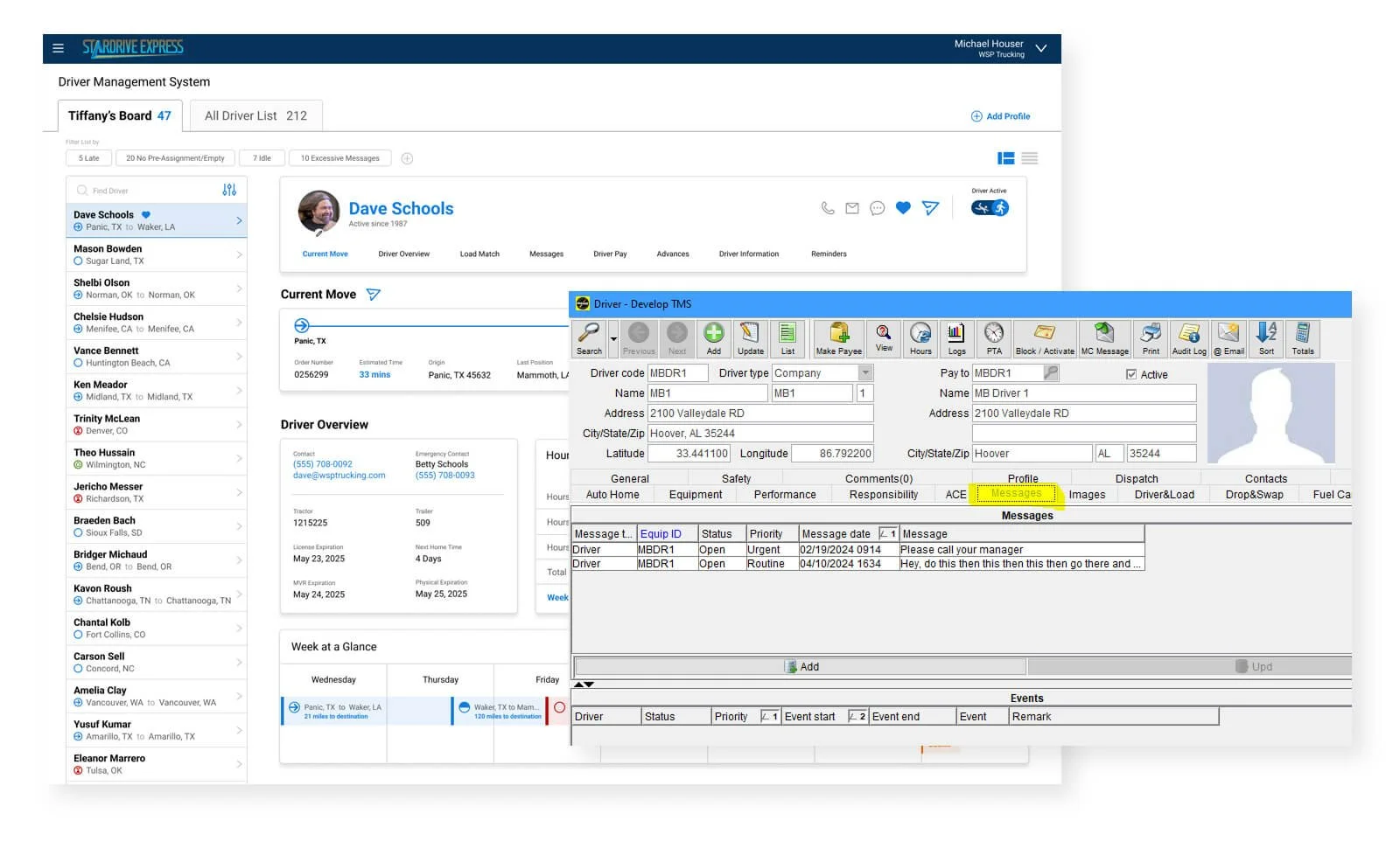
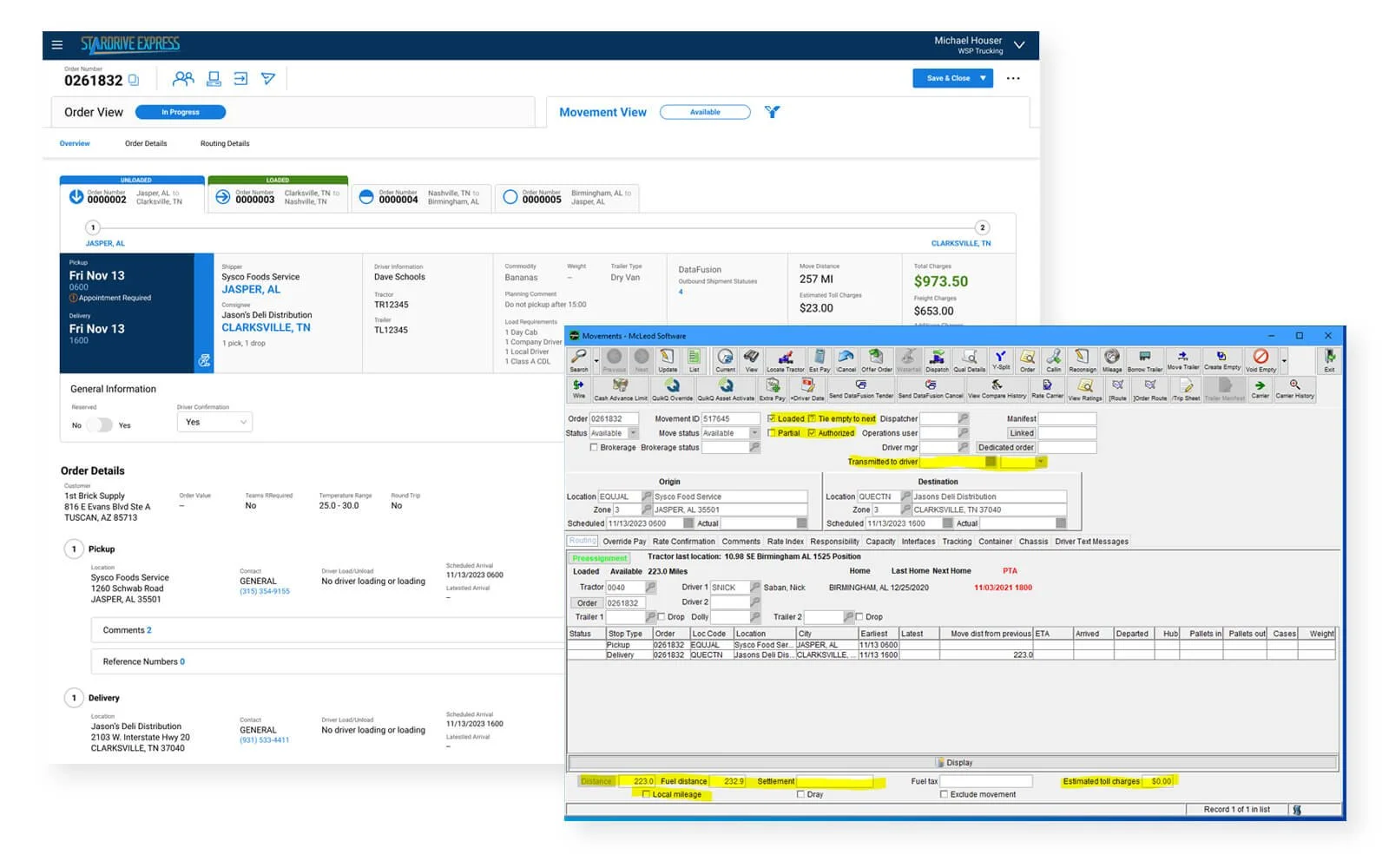
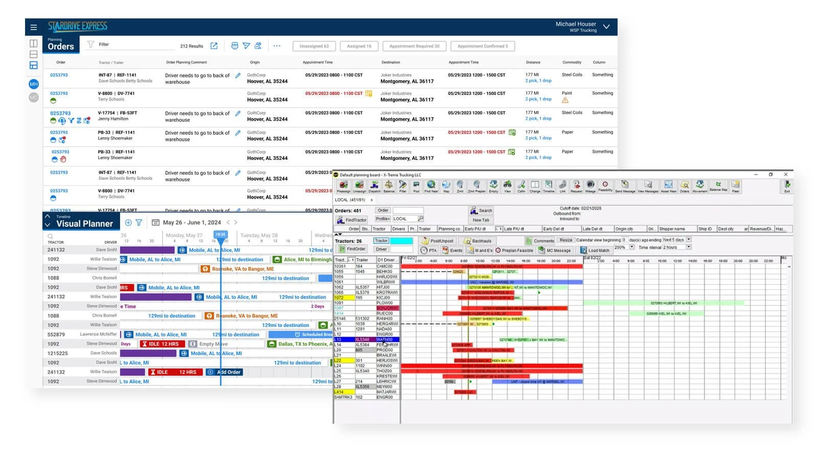
The software I inherited was a Java Swing client — built with the visual language of the 1990s, still running in 2019. For the most powerful TMS in the industry, the experience was punishing. Entering an order meant navigating a screen packed with dozens of input fields, and any action beyond the basics triggered a daisy chain of dialog boxes, each spawning a new window. Dispatching a load meant repeating that pattern across multiple windows with no automation, no guidance, and no sense of what came next.

The system knew everything about freight logistics. It knew nothing about the person sitting in front of it. Going from order entry to carrier match to dispatch — what the industry calls cradle to grave — required weeks of training just to survive the interface.

"The system knew everything about freight logistics. It knew nothing about the person sitting in front of it."

01 · Getting Our Feet Wet

PowerBroker: From Horizontal Sprawl to a Single Scannable Screen

The first product the company wanted to modernize was PowerBroker, McLeod's brokerage TMS built to match loads to carriers and drivers. The problems were immediately visible. The classic list view presented data as thin, single-line rows that scrolled endlessly to the right — users had to chase information horizontally across multiple screens just to get a complete picture of a single load. It was data-rich and insight-poor.

My first move was to redesign the row itself. By grouping and pairing related information, and stripping the view down to only what a broker actually needed to make a match, we transformed that horizontal sprawl into a single, scannable screen. Brokers could now read a load at a glance — and drill into the full detail when they needed it, not because the interface forced them to.

From there, we continued modernizing the entire workflow so brokers could match loads to carriers, confirm dispatch, and maintain visibility into the driver's progress toward the load — all within a handful of clicks, without ever leaving the main orders screen.

New Brokerage Planning Screen
The new Brokerage Planning — a single scannable view replacing the legacy multi-screen experience.
Legacy Version
The original legacy version: data-rich, insight-poor, and punishing to navigate.
02 · Gaining Momentum

LoadMaster: The Full Journey, Finally in One Place

The second product — and the far more complex undertaking — was LoadMaster. Where PowerBroker focused on the front end of a load, LoadMaster owned the entire journey, from order entry through final delivery. It also carried responsibilities that had nothing to do with the load itself: driver hours and qualifications, vehicle maintenance, driver well-being and payments, and the constant financial pressure of minimizing empty miles.

The users weren't a single persona either. Some only entered orders. Some matched and dispatched. Others were dedicated to managing drivers full-time — monitoring their location, their compliance, their availability, and keeping them on track across every leg of a run. Some users did all of it. The old experience treated every one of those responsibilities as its own island, requiring users to navigate dozens of clicks across multiple screens just to get a clear picture of a single load.

Our work changed that. We consolidated the full lifecycle of a load — where it had been, where it was, and where it was going — into a single, unified view. Adjusting a destination or modifying a stop dropped from a multi-window ordeal to two clicks. And the overall health of an order, something that once required significant labor to piece together, could now be understood at a glance.

Movement View / Order View
Movement View (active), Order View (inactive tab), and multiple stops — all visible in a single unified screen.
Timeline Visual Planner
Timeline View + Orders — users see driver activity from past, present, and future perspectives simultaneously.
03 · The Foundation

Design System: The First One McLeod Had Ever Seen

What made this transformation significant wasn't just the reduction in clicks or the consolidation of screens — it was the shift in how a piece of software respected the people using it. McLeod's products were already the most powerful in the industry. My job was to make sure that power was finally accessible.

Working as the sole UX practitioner across an entire suite of enterprise products, I built the design foundation from the ground up — the first design system the company had ever seen. It standardized components and patterns across product lines and compressed workflow design time from several weeks to a single day.

Beyond the system itself, I taught design thinking to teams who had never worked alongside a designer, and shaped a product experience that met users where they were rather than demanding they adapt to the software. The result was a platform that felt modern because it thought about people first.

Driver Management System
Driver Management — making the tools to complete tasks as intuitive as the complexity of the role demands.
In Closing · Teaching Design Thinking

The accomplishment I'm most proud of isn't the interface. It's the design thinking that wasn't present when I arrived.

Reflecting on my time at McLeod, what I'm most proud of isn't the interface I built from scratch, the design system, or the problem-solving that went into screens with dozens of competing variables. It's the design thinking that wasn't present when I arrived — but was alive in everyday conversations by the time I left.

Getting a team to think that way is a labor of love. There are a lot of whys. A lot of patience. A lot of repetition before anything takes hold. But when it does, something shifts in the culture. A few years in, you find yourself hearing a product owner, a developer, a business analyst, or a scrum master instinctively critique a workflow using the right language — asking the right questions — and arriving at better solutions because of it.

That, more than any deliverable, is the most rewarding part of this work. Design thinking isn't a solo practice. It's contagious if you're willing to teach it. We're all teachers, if we want to be.